Inspire - Capo Productions
Web Components
Web Components 是一组现代的 Web 开发标准和技术,它的一系列 HTML 和 DOM 的特性加入 w3c 标准,允许开发者创建封装好的、可复用的自定义元素。这些自定义元素可以在 HTML 中用作一等公民,与原生的 HTML 元素一样的使用。
步骤:
- 创建一个模板
<template>。 - 继承
HTMLElement创建一个类。 - 使用
customElements.define注册自定义元素。 - 将 HTML 中使用自定义元素。
特点
Web Components 由 3 个核心部分组成
Custom Elements
这项技术允许开发者定义自己的 HTML 元素。可以创建新的 HTML 标签,并定义它们的行为。一旦一个 Custom Element 被定义和注册,可以在页面上像使用其他 HTML 元素一样使用它。
html
<my-element></my-element>Shadow DOM
Shadow DOM 允许开发者封装一个 DOM 子树和样式,让它们与主文档的 DOM 保持独立。这意味着在组件内部定义的样式不会影响到外部的页面,反之亦然。
Shadow DOM 是 Web Components 的一部分,允许你将一部分 DOM 隐藏在组件内部,使其样式和结构不会影响或被外部影响。通俗点说:它就像一个“独立的小黑屋”,里面的 HTML 和 CSS 不会影响外面的世界,外面的世界也不能影响里面。
例如,在 Shadow DOM 中的样式只影响 Shadow DOM:
html
<my-element>
  #shadow-root
    <style>
      p { color: red; }
    </style>
    <p>This is in shadow DOM and styled red.</p>
</my-element>HTML Templates
HTML Templates 通过 <template> 和 <slot> 元素,允许定义一个可以在 JavaScript 中使用的 HTML 片段。它在不被引用的情况下不会被渲染,且不会影响页面的加载。 例如:
html
<template id="my-template">
  <p>My Template</p>
</template>外界如何访问组件
html
<custom-button id="custom-button"></custom-button>

<script>
  class CustomButton extends HTMLElement {
    constructor() {
      super();
      const shadow = this.attachShadow({ mode: 'open' });
      shadow.innerHTML = `
        <style>
          button {
            background: blue;
            color: white;
            border: none;
            padding: 8px 12px;
            border-radius: 4px;
          }
        </style>
        <button>Click me</button>
      `;
    }
  }

  customElements.define('custom-button', CustomButton);
</script>mode: 'open' 代表你可以用 JavaScript 访问 element.shadowRoot。
jsconst customButton = document.getElementById('custom-button') const shadow = customButton.shadowRoot const button = shadow.querySelector('button') button.addEventListener('click', () => { alert('Button clicked') })mode: 'closed' 则不能访问,完全封闭。
外界如何修改组件样式
方式一:使用 CSS 变量
在组件内部用 var(--xxx),外部通过设置 CSS 变量影响组件内部样式:
html
<!-- 组件内部样式 -->
<style>
  .top {
    color: var(--my-color, red); /* 默认red,外部可覆盖 */
  }
</style>html
<!-- 外部设置变量 -->
<style>
  my-template {
    --my-color: blue;
  }
</style>方式二:使用选择器选择组件,然后给组件自身设置样式
css
my-template {
  /* 别忘了 */
  display: block;
  border: 1px solid #ccc;
}方式三:使用 ::part 和 part 属性
给组件内部元素加 part 属性,外部用 ::part 选择器定制样式。
html
<!-- 组件内部 -->
<div class="top" part="top">
  ...
</div>css
/* 外部样式 */
my-template::part(top) {
  color: green;
  font-weight: bold;
}示例
这个示例中
- 使用了
<template>和<slot>元素,并使用了样式。 - 组件内容通过组件属性传入,而不是写死在模板中。
- 监听组件属性变化,更新组件内容。
html
<template id="my-template">
  <!-- 样式 -->
  <style>
    .top {
      color: red;
    }
  </style>

  <div class="top">
    <span id="greeting"></span>
    <span id="target"></span>
  </div>
  <div>
    <slot name="content"></slot>
  </div>
</template>

<my-template greeting="hello" target="world">
  <span slot="content">你好</span>
</my-template>

<button id="change">change</button>

<script>
  customElements.define(
    'my-template',
    class extends HTMLElement {
      constructor() {
        super();

        const template = document.querySelector('#my-template');

        // 给宿主元素添加影子 DOM,this 指向宿主元素
        this.attachShadow({ mode: 'open' });
        // 获取影子 DOM
        const shadow = this.shadowRoot;
        // 将模板内容添加到影子 DOM
        shadow.appendChild(template.content.cloneNode(true));

        this._updateContent();
      }

      // 包含元素需要变更通知的所有属性名称
      static observedAttributes = ['greeting', 'target'];

      // 当观察的属性发生变化时,会调用此方法
      attributeChangedCallback(name, oldValue, newValue) {
        if (oldValue !== newValue) {
          this._updateContent();
        }
      }

      _updateContent() {
        const shadow = this.shadowRoot;
        if (!shadow) return;
        const greeting = this.getAttribute('greeting') || '';
        const target = this.getAttribute('target') || '';
        if (shadow.getElementById('greeting')) shadow.getElementById('greeting').textContent = greeting + (greeting ? ', ' : '');
        if (shadow.getElementById('target')) shadow.getElementById('target').textContent = target;
      }
    }
  );

  const change = document.querySelector('#change');
  change.addEventListener('click', () => {
    const myTemplate = document.querySelector('my-template');
    myTemplate.setAttribute('target', 'Jack');
  });
</script>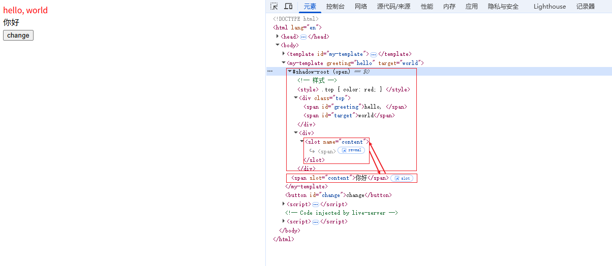
Preview